Stocks-for-the-long-run type charts commonly plot the marvellous growth story of the US market. Sometimes you’ll also get the UK thrown in for good measure.
However you rarely see much mention of our great European frenemies: Germany and France.
Partly that’s because our cultural conversation is dominated by the US.
But it’s also because the continentals’ stock market history isn’t such a wonderful advert for investing. In fact if long-term US stock returns were similar to theirs, I suspect investing wouldn’t be anywhere near as popular as it is in the Anglosphere.
So let’s turn to our near neighbours to discover what a torrid equities experience looks like.
(All charts show inflation-adjusted total returns, reported in local currency.)
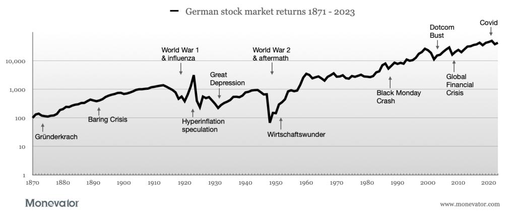
German stock market returns
Data from JST Macrohistory1 and MSCI. March 2024.
Average real annualised return = 4.0%
Cumulative growth of 1DM/euro = 426.7
Best annual return = 149.7%, 1923
Worst annual return = -90.0%, 1948
Volatility = 31.4%
The German graph looks remarkably similar to the UK experience, with three main exceptions. Namely 1920s’ hyperinflation, the aftermath of World War 2, and Germany’s comparatively smooth sailing through the 1970s.
You can’t help but stare in wonder at the priapic spike driven by the stock market frenzy that accompanied hyperinflation from 1921 to 1923.
We’ve all heard of the wheelbarrows full of worthless money in Germany back then. In that climate, the stock market was a rare place you could protect your wealth – at least for a time.
Even in after-inflation terms, the market rose 722% between 1921 and 1923. It then imploded – falling by 92% over the next two years.
By 1931, in the midst of the Great Depression, the index had been set back 50 years, to levels last seen in 1881.
War hammered
From that nadir, equities rose by double digits for five years in a row. By which time the Nazis were firmly in power.
After a slight wobble in 1938, markets advanced again from 1939 to 1940 in lockstep with German tanks. Stocks were largely domestically-owned and the 30% increase in 1940 speaks to the string of victories scored on the battlefield.
The market continued to rise, even as the Germans were stopped outside Moscow. But then the Nazi government imposed a stock price floor from 1943 as its fortunes deteriorated. This move essentially froze prices for the remainder of the war. Traders declined to buy stocks that were kept aloft by artificial gravity.
1948’s vertiginous 90% drop accompanied the revaluation of the German currency to 10% of its former value.
At that point, German stocks were worth 33% less than they had been in 1871.
So much for ‘stocks for the long run’.
The only way is up
However this uncompressed calamity was followed by a 121% rebound the following year, as the post-war Wirtschaftswunder2 began to take hold.
By 1958 your stocks would have made 2021% if you’d bought into the German market in 1948.
How many people could or would have done that? Vanishingly few, I suspect.
Elsewhere the UK’s worst stock market crash still lay ahead. Our home market tombstoned -72% from 1973 to 1974.
But in contrast the German market only declined 24% during the same period.
And now, if you look back 50 years, German returns average 5.9% annualised. That compares to 6.2% annualised for the UK and 7.1% for the US.
Nevertheless, the catastrophic German war experience has left its imprint in the country’s relatively subdued overall market return of 4% annualised over the very long-term.
French stock market returns
Alas, as the French chart shows, there are other roads besides defeat in war that lead to stock market perdition:
Average real annualised return = 1.2%
Cumulative growth of 1F/euro = 6.58
Best annual return = 115.9%, 1954
Worst annual return = -46.0%, 1945
Volatility = 21.8%
Japan is the cautionary tale commonly used by seasoned investors to scare the younglings – but it should be France.
Unlike Japan, the French market is still 33% below its World War 2 peak some 80 years later.
French equities lost 96% of their value from 1942 to 1950. But the slide didn’t stop there. The market continued to crumble for another 27 years, until 98% had been lost peak-to-trough.
Paradoxically, the French economy and people enjoyed a 30-year boom after World War 2 – a period that came to be known as Les Trente Glorieuses.
But the benefits weren’t felt by French investors.
Returns were undermined by industrial nationalisation and high inflation. It wasn’t until 1983 that the market was defibrillated back into life by Mitterand’s tournant de la rigeur economic reforms.
By then, the stock market had been a disaster area since 1914. That long era of investor sorrow has saddled French equities with a bond-like 1.24% long-run annualised return.
Yes, the past 50 years have seen French shares recover to a perfectly respectable 5.3% annualised. Even so I still believe the gallic experience is the best riposte to home bias imaginable.
The German and Japanese downturns are clearer illustrations of investing risk.
But France’s lost years demonstrate that equity rewards do not necessarily flow from economic success (something we’ve seen again more recently with certain emerging markets).
UK and US stock market returns
By way of contrast, here’s the growth charts for UK and US equities:
Real total return data from JST Macrohistory3 and FTSE Russell. March 2024.
Average real annualised return = 5.3%
Cumulative growth of £1 = 2,521.55
Best annual return = 103.4%, 1975
Worst annual return = -57.0%, 1974
Volatility = 17.5%
Data from JST Macrohistory 4 and Aswath Damodaran. March 2024.
Average real annualised return = 6.8%
Cumulative growth of $1 = 24,640.33
Best annual return = 60.9%, 1933
Worst annual return = -41.0%, 2008
Volatility = 18.4%
International long-term returns
And for completeness here’s how our foursome compare when you plot them all on the same chart:
I wonder how many people look at the blistering US performance and decide to go all-in on an S&P 500 ETF?
Especially after US stocks’ recent stunning results.
Or maybe it’s time to switch to Japan? It now edges the US from 1900 to 2023 (6.3% versus 6% annualised) according to the latest Global Investment Returns Yearbook.
Or how about a bet on nordic tigers Sweden and Denmark? They’ve enjoyed US-level returns over the past 150 years.
Me? I don’t think any regime can last forever so I’m sticking with my global tracker fund.
Take it steady,
The Accumulator
Òscar Jordà, Katharina Knoll, Dmitry Kuvshinov, Moritz Schularick, and Alan M. Taylor. 2019. “The Rate of Return on Everything, 1870–2015.” Quarterly Journal of Economics, 134(3), 1225-1298.‘Economic miracle’.Òscar Jordà, Katharina Knoll, Dmitry Kuvshinov, Moritz Schularick, and Alan M. Taylor. 2019. “The Rate of Return on Everything, 1870–2015.” Quarterly Journal of Economics, 134(3), 1225-1298.Òscar Jordà, Katharina Knoll, Dmitry Kuvshinov, Moritz Schularick, and Alan M. Taylor. 2019. “The Rate of Return on Everything, 1870–2015.” Quarterly Journal of Economics, 134(3), 1225-1298.
The post The contrasting fortunes of Britain’s European stock market rivals appeared first on Monevator.


