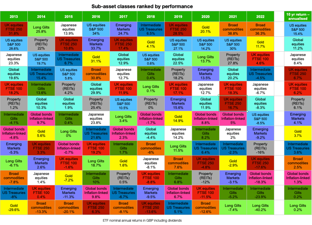
After a bruising 2022, it’s time once again to take refuge under our asset allocation quilt. This colourful data duvet ranks the main asset classes (and sub-asset classes) by annual return over the last decade. The resulting patchwork of changing fortunes is a wonderfully intuitive way of illustrating how difficult it is to predict investing’s winners and losers in advance.
The merest glance at the crazy clash of pixels reveals that any asset’s claim on the top spot is about as durable as the average K-pop star’s career.
But despite the explosion-in-a-Lego-factory vibe, the asset allocation quilt does have something to tell us about real diversification and its limits.
Let’s pull back the covers!
Asset allocation quilt 2022
Our updated asset allocation quilt is shown below.
The chart ranks the main equity, bond, and commodity sub-asset classes for each year from 2013 to 2022 from the perspective of a UK investor who puts Great British Pounds (GBP) to work:
We’ve sourced annual returns from publicly available ETFs that represent each sub-asset class.The data is courtesy of justETF – an excellent ETF finder, screener, and portfolio building service.Returns are nominal1. To obtain real returns, subtract 3.2% – the average UK inflation rate 2013-2022 – from the nominal figures quoted in this article.Returns take into account the Ongoing Charge Figure (OCF), dividends or interest earned, and are reported in pounds.Again, because readers are overlooking it – these are GBP returns. So if you’re a UK investor in the US, for instance, you did better than the S&P 500 index with your fund, because the pound weakened versus the dollar. (We’ve written more about such currency risk).
Changes from last year’s 2021 asset allocation quilt
We’ve added two bond sub-asset classes this year:
Intermediate maturity US TreasuriesLong maturity UK gilts
It may seem odd to include more bond types after a disastrous year for debt. But I’d argue that a time of scorn is precisely when we need a deeper understanding of our antagonist.
I’ve put US Treasuries in because they may offer superior diversification for UK investors in an era when the dollar is a safe-haven currency, and gilts are losing their lustre. (Political risk, anyone?)
That’s the theory, anyway.
The strategy depends on sterling dropping against the dollar whenever there’s a big dust-up on the global stage. Should that happen on cue, then a UK investor in US Treasuries can add currency gains on top of the government bond bounce we’d always hope for when equities wilt.
However – if the pound rose instead, then currency losses could undermine US Treasury returns at the very moment you want them to prop up your portfolio.
So holding un-hedged foreign bonds is not without risk. And indeed the unwelcome potential for an additional dollop of pain from such currency moves is precisely why traditionally we’ve always been advised to hold bonds in domestic or currency-hedged flavours.
What’s the evidence supporting US Treasuries?
Intermediate US Treasuries have outperformed intermediate UK gilts from a UK investor’s perspective during nearly every equity market correction or bear going back to the dotcom bust – the one exception being the 2011 August downturn.
However, Treasuries made a bad situation worse during the 1994, 1990, and 1987 market slumps.
In the case of 1987’s Black Monday Crash, US Treasuries would have heaped a double-digit loss on top of the stock market pain.
In contrast gilts were a +18% oasis of calm that year.
So switching to Treasuries is a gamble. A currency bet that paid off again in 2022 mind you, as sterling’s woes meant US Treasuries only lost -4.5%, versus intermediate gilts’ -24% swan dive.
The longer-term situation isn’t so clear cut. US Treasuries beat gilts over the last ten years. But UK government bonds have outpaced US govies over different timeframes.
Still, the notion that Treasuries could be a super-diversifier is intriguing. Hence we’re patching them onto the asset allocation quilt.
As we often say about such things, you could do, say, half-and-half – as opposed to going all-in on swapping your gilts for US Treasuries.
Stitch this
Long-dated gilts also get an invite to the asset allocation block party because they offer something different.
Okay, so this year’s -40% loss is the kind of different you can live without, I hear you cry.
But let me explain.
The long duration characteristics of long-dated gilts make them extremely sensitive to changes in interest rates.
That property can make long bonds the best diversifier in your portfolio during a recession, when equities and interest rates both go into retreat.
But we saw the dark side of the bargain in 2022. Rapidly rising bond yields rendered long bonds radioactive and nobody wanted to touch them.
Ironically, current bond yields – which have come about precisely because of the 2022 slump in prices – have recharged the asset’s ability to deflect the next stock market implosion.
We’ll keep an eye on them in the quilt from here.
The final change we’ve made is to drop European equities to make room for these bonds.
One more row of violent checks felt unpalettable, so they’re gone. Sorry. Not sorry.
A chequered past
It’s hard not to notice on eyeballing the quilt that broad commodities and gold were the only asset classes you should really have wanted under your Christmas tree in December 2021.
For broad commodities, maintaining decent exposure is problematic, however.
A broad commodities fund uses futures contracts to track a diversified basket of raw materials – oil, livestock, cash crops, industrial metals, that sort of thing.
And I’d bet hardly any passive investors held those commodity future funds last year, because as the quilt shows they inflicted hideous losses on investors from 2011 to 2020.
Notice how their orange blocks mostly prop up the bottom of the table – barring a brief Whac-A-Mole leap out of their hole in 2016.
Most investors would have thrown in the quilt. I mean the towel!
However commodities did finally do their diehard fans proud in 2021 and 2022, with two big performances that almost make them look like worthwhile portfolio additions.
Almost… but not quite. Their 10-year annualised return is still negative after inflation.
2022’s commodities performance is akin to an expensive striker who’s essentially useless – but he came off the bench once, scored an absolute screamer, and won a famous victory.
So you keep them on in the hope they’ll do it again. But mostly they just suck your soul.
In investment terms, that translates as commodities delivering bond-like returns but with equity-style volatility over the long-term.
Or, to put it crudely: occasionally they’re brilliant but typically they’re terrible.
And the maths of that doesn’t compound into great returns over the long years.
Golden brown
Gold is potentially a more palatable alternative. Its position on the asset allocation checkerboard looks like the proverbial game of two halves.
Gold is either vying for Champions League places, or flirting with relegation.
Like its broad commodity cousin, then, gold is a diversification wild card.
It exhibits near zero correlation with equities and bonds (i.e. anything could happen), it has poor long-term expected returns, but – as in the 1970s and in 2008 – in 2022 gold provided portfolio relief when other asset classes could not.
Shady business
Another bamboozler from the weird world of asset allocation is that inflation-linked bonds were a disaster just when you’d expect them to shine.
Sadly, the inflation-linked bond funds that many people hold had quite high durations going into 2022. That left them vulnerable to interest rate rises. (We raised the alarm in 2016, but not loudly enough in hindsight.)
The pace of interest rate rises in 2022 hit these funds with capital losses that overwhelmed their inflation defences like a storm surge deluging a sea wall.
So while investors should benefit from increased yields in the aftermath, the enduring lesson of 2022 is that protection is best sought via carefully-selected individual index-linked gilts, or short duration inflation-linked bonds.
Sadly, other useful inflation hedges are in short supply.
King of the swingers
Perhaps the swingiest asset on our disco dancefloor are the FTSE 250 equities.
The UK’s mid cap stocks have been up and down like the Assyrian Empire as Eric Idle would say.
A year of table-topping glory is invariably followed by 12-months of mediocre-to-dismal performance.
What’s going on at the UK’s medium-sized firms? Does the workforce do one year on, one year off?
My deeply boring rational brain is droning on about it [nerd voice] “simply being an artefact of the timeframe and valuation multiples de-rating, actually…”
…whereas the superstitious, pattern-spotting side of my nature is already banking on 2023’s double-digit rebound. What could possibly go wrong?
Intriguingly, property is similarly whipsaw-y.
It’d be interesting to see if a rebalancing bonus could be achieved by selling out of either asset after an exceptional year and buying in following a poor year.
Passive investing luminary William Bernstein has previously advocated such a strategy with super-volatile gold mining stocks.
But that’s enough naughty speculation for one year!
Full spectrum response
Take notice of how the multi-coloured mayhem settles into a more familiar array when viewed via the rightmost ten-year annualised returns.
Bonds, gold, and commodities are at the bottom of the heap, just as we’d expect.
Equities sit atop the ten-year column as prime slabs of capital really should.
But the divergent outcomes among the different equity sub-categories shows why we need all sorts of assets in our mix.
Long-term investing is a game of sliding blocks. The S&P 500 could easily trade places with the Emerging Markets or the FTSE 100 in the next decade.
Perhaps that’s why the asset class that makes the most sense is global equities. It hasn’t once reached No.1, but it’s still showing an amazing 10-year return.
For sure, global trackers lag the US for now. But there have been many decades when the S&P 500 has been surpassed by the rest of the world.
US equities just notched their lowest position yet on our ten-year asset allocation quilt, so perhaps they are finally coming off the boil.
Still, the common thread here is expected asset class behaviour.
Over time equities of all stripes should do relatively well but we don’t know how the sub asset-classes will stack up. Meanwhile, the other asset classes are there to patch up the holes when bad years for equities leave our portfolios needing stitches.
Best to have a bit of (nearly) everything.
Maybe we should call such a portfolio an asset allocation pick-and-mix?
Take it steady,
The Accumulator
That is to say they are not adjusted for inflation.
The post Asset allocation quilt – the winners and losers of the last 10 years appeared first on Monevator.


