The CAPE ratio is widely considered to be a useful stock market valuation signal. So if you own a globally diversified portfolio then you may well be interested in good CAPE ratio by country data that can help you understand which parts of the world are under- and overvalued.
To that end I’ve collated the best global CAPE ratio information I can find in the table below.
CAPE ratio by country / region / world
Region / Country
Research Affiliates (30/06/23)
Barclays Research (31/5/23)
Cambria Investment (14/04/23)
Historical median (Research Affiliates)
Global
n/a
n/a
16
n/a
Developed markets
26
n/a
20
23.5
Emerging markets
14
n/a
14
15
Europe
17.5
20
–
16.5
UK
13
15.5
14.5
14
US
31
29
28.5
16.5
Japan
21
21
19
33
Germany
14.5
19.5
16
17.5
China
10
11
11
15.5
India
29.5
31
28.5
21.5
Brazil
11
12
10.5
14
Australia
17
20
18
16.5
South Africa
14.5
16
15.5
18
Source: As indicated by column titles, compiled by Monevator
A country’s stock market is considered to be overvalued if its CAPE ratio is significantly above its historical average. The converse also holds. Meanwhile a CAPE reading close to the historical average could indicate the market is fairly valued.
You should only compare a country’s CAPE ratio with its own historical average. Inter-market comparisons are problematic.
There’s more countries and data to play with if you click through to the original sources linked in the table. All sources use MSCI indices. Cambria uses MSCI IMI (Investible Market Indices). Research Affiliates derives US CAPE from the S&P 500. You can also take the S&P 500’s daily Shiller P/E temperature.
But what exactly is the CAPE ratio, what does it tell us, and how credible is it?
What is the CAPE ratio?
The CAPE ratio or Shiller P/E stands for the cyclically adjusted price-to-earnings ratio (CAPE).
CAPE is a stock market valuation signal. It is mildly predicative of long-term equity returns. (The CAPE ratio is even more predictive of furious debate about its accuracy).
In brief:
A high CAPE ratio correlates with lower average stock market returns over the next ten to 15 years.
A low CAPE ratio correlates to higher average stock market returns over the next ten to 15 years.
The CAPE ratio formula is:
Current stock prices / average real earnings over the last ten years.
To value a country’s stock market, the CAPE ratio compares stock prices and earnings numbers in proportion to each share’s weight in a representative index. (For example the S&P 500 or FTSE 100 indices).
But company profits constantly expand and contract in line with a firm’s fortunes. National and global economic tides ebb and flow, too.
So CAPE tries to clean up that noisy signal by looking at ten years’ worth of earnings data. For that reason CAPE is also known as the P/E 10 ratio.
What can I do with global and country CAPE ratios?
The CAPE ratio has three main uses:
Some wield it as a market-timing tool to spot trading opportunities. A low CAPE implies an undervalued market. One that could rebound into the higher return stratosphere. Conversely, a high CAPE ratio may signal an overbought market that’s destined for a fall.
Similarly, CAPE – and its inverse indicator the earnings yield (E/P) – may enable us to make more sensible future expected return projections.
High CAPE ratios are associated with lower sustainable withdrawal rates (SWR) and vice versa. So you might decide to adjust your retirement spending based on what CAPE is telling you.
But is CAPE really fit for these purposes?
Well I think you should be ready to ask for your money back (you won’t get it) if you try to use CAPE as a market-timing divining rod.
But optimising your SWR according to CAPE’s foretelling? There’s good evidence that can be worthwhile.
How accurate is CAPE?
It’s certainly more predictive of negative energy than being told by a woman in a wig that you’re a Pisces dealing with a heavy Saturn transit.
But the signal is as messy as mucking about with goat entrails.
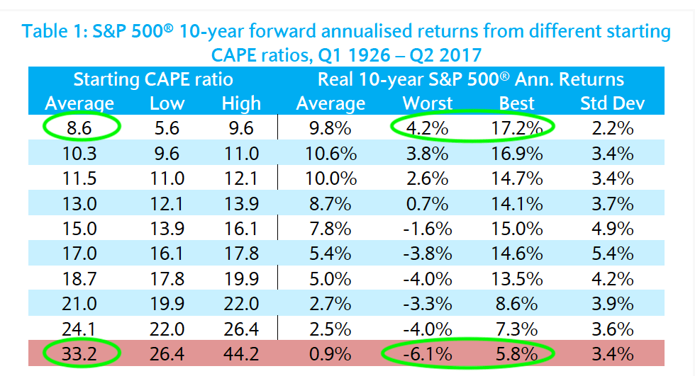
The table below shows that higher CAPE ratios are correlated with worse ten-year returns. Notice there’s a wide range of outcomes:
Source: Robert Shiller, Farouk Jivraj, The Many Colours Of CAPE
The overall trend is clear. But a market with a high starting CAPE ratio can still deliver decent 10-year returns. Equally, a low CAPE ratio might yet usher in a decade of disappointment.
When it comes to hitting the bullseye, therefore, the CAPE ratio looks like this:
Portfolio manager Norbert Keimling has dug deeper. His work showed that the CAPE ratio by country explained about 48% of subsequent 10-15 year returns for developed markets.
Source: Norbert Keimling, Predicting Stock Market Returns using the Shiller CAPE
You can see how lower CAPE ratios line up on the left of this graph with higher returns, like prom queens pairing off with jocks.
There’s no denying the trend.
Not all heroes wear a CAPE
Strip away the nuance and you could convert these results into an Animal Farm slogan: “Low CAPE good. High CAPE bad.”
However animal spirits aren’t so easily tamed!
Keimling says the explanatory power of CAPE varies by country and time period. For example:
Japan = 90%
UK = 86%
Canada = 1%
US = 82% since 1970
US = 46% since 1881
Despite such variation, however, the findings are still good enough to put CAPE in the platinum club of stock market indicators. (It’s not a crowded field).
In his research paper Does the Shiller-PE Work In Emerging Markets, Joachim Klement states:
Most traditional stock market prediction models can explain less than 20% of the variation in future stock market returns. So we may consider the Shiller-PE one of the more reliable forecasting tools available to practitioners.
But I wouldn’t want to hang my investing hat on World CAPE’s 48% explanation of the future.
Nobody should bet the house on a fifty-fifty call.
Don’t use CAPE to predict the markets
Let’s consider a real world example. Klement used the CAPE ratio to predict various country’s cumulative five-year returns from July 2012 to 2017.
As a UK investor, the forecasts that caught my eye were:
UK cumulative five-year real return: 43.8%
US cumulative five-year real return: 24.5%
The UK was approximately fairly valued according to historical CAPE readings in 2012. The US seemed significantly overvalued.
Yet if that signal caused you to overweight the UK vs the US in 2012, you’d have regretted it:
Source: Trustnet Multi-plot Charting. S&P 500 vs FTSE All-Share cumulative returns July 2012-17 (nominal)
From these returns, we can see that the ‘overvalued’ S&P 500 proceeded to slaughter the FTSE All-Share for the next five years. (In fact it did so for the next ten.)
As a result, CAPE reminds me of my mum warning me that I was gonna hurt myself jumping off the furniture.
In the end she was right. But it took reality a while to catch up.
Using the global CAPE ratio to adjust your SWR
The CAPE ratio is best used as an SWR modifier.
Michael Kitces shows that a retiree’s initial SWR is strongly correlated to their starting CAPE ratio:
A high starting CAPE ratio1 maps on to low SWRs. When the red CAPE line peaks, the blue SWR line troughs and vice versa.
William Bengen (the creator of the 4% rule) concurs with Kitces’ findings:
And Early Retirement Now also believes a high CAPE is a cue to lower your SWR.
However all these experts base their conclusions on S&P 500 numbers. Can we assume that CAPE ratio by country data is relevant to UK retirees drawing on a globally diversified portfolio?
Yes, we can.
Keimling says:
In all countries a relationship between fundamental valuation and subsequent long‐term returns can be observed. With the exception of Denmark, a low CAPE of below 15 was always followed by greater returns than a high CAPE.
Likewise, Klement found:
Shiller-PE is a reliable indicator for future real stock market returns not only in the United States but also in developed and emerging markets in general.
Michael McClung, author of the excellent Living Off Your Money, also advises using global CAPE to adjust your SWR.
The spreadsheet that accompanies his retirement book does the calculation for you. You just need to supply the World CAPE ratio and an Emerging Markets CAPE figure. Our table above does that.
Incidentally, one reason I included three sources of CAPE ratio in my table is to show there’s no point getting hung up on the one, pure number. Because there’s no such thing.
Meanwhile, Big ERN has devised a dynamic withdrawal rate method based on CAPE.
Conquering the world
Finally, if you want to use Bengen’s more simplistic Rules For Adjusting Safe Withdrawal Rates table shown above, you’ll need to translate his work into global terms.
Bengen’s over/under/fairly valued categories assume an average US historical CAPE of around 16.
You can adapt those bands to suit your favourite average from our CAPE ratio by country table.
Bengen’s work suggests that a CAPE score 25% above / below the historic average is a useful rule-of-thumb guide to over or undervaluation.
A base SWR of 3% isn’t a bad place to start if you have a global portfolio. Check out this post to further finesse your SWR choice.
Take it steady,
The Accumulator
The CAPE ratio is labelled Shiller CAPE in the graph.
The post CAPE ratio by country: how to find and use global stock valuation data appeared first on Monevator.


